Forecast Accuracy Metrics: MAPE vs MAD vs RMSE
MAPE, MAD, and RMSE each answer a different question. Compare them side by side on units, outliers, and low-volume behavior, and pick the right metric for each SKU.
You run the same forecast through three metrics and get three different verdicts. MAPE says the forecast is fine. RMSE says it's a mess. MAD lands somewhere in between. So which one's telling the truth? All of them, actually, they're just answering different questions. The trick isn't crowning a winner. It's knowing which metric to read when.
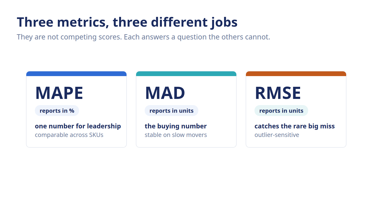
MAPE, MAD, and RMSE each measure forecast error differently: MAPE gives you a shareable percentage, MAD keeps the answer in units, and RMSE punishes big misses hardest. There's no single best forecast accuracy metric. You match it to the SKU's volume and to the kind of error that actually hurts, and most planners track more than one.
How do MAPE, MAD, and RMSE differ?
MAPE, MAD, and RMSE differ on three things that matter for planning. They split on the unit they report in, how they treat a single big miss, and how they behave near zero. MAPE speaks in percentages, MAD and RMSE speak in units, and only RMSE leans hard on outliers. Pick the wrong one and the number quietly misleads you.
Here's the short version before we compare them side by side. Each metric is built from the same raw ingredient, the gap between what you forecast and what actually sold. Where they split is what they *do* with that gap. For the actual formulas and worked calculations, each has its own deep-dive: MAPE, MAD, and RMSE. This page compares them so you know which to reach for. If you want the ingredient itself, start with forecast error.
The side-by-side comparison
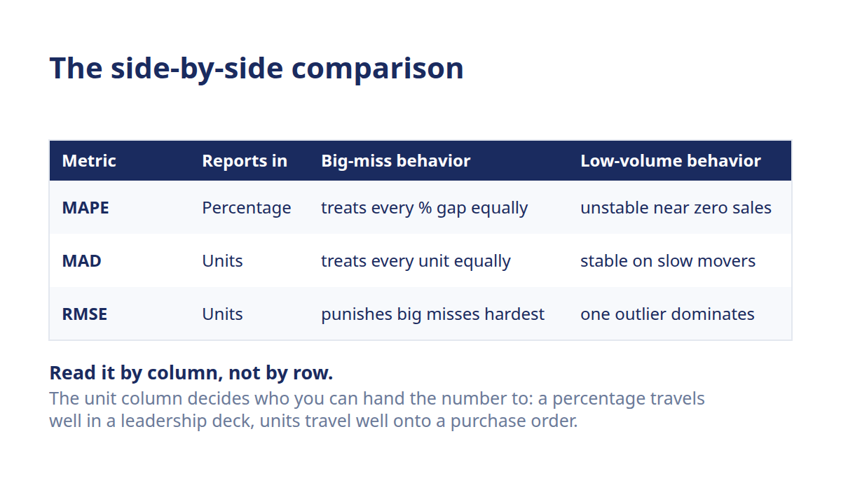
- MAPE (Mean Absolute Percentage Error): reports in: Percentage (%); big-miss behavior: Treats every % gap equally; low-volume behavior: Unstable, blows up near zero sales; best used for: Sharing one number with leadership; comparing across SKUs
- MAD (Mean Absolute Deviation): reports in: Units; big-miss behavior: Treats every unit of error equally; low-volume behavior: Stable, stays readable on slow movers; best used for: Buying decisions; low-volume and intermittent SKUs
- RMSE (Root Mean Square Error): reports in: Units; big-miss behavior: Punishes big misses hardest (squares the error); low-volume behavior: Stable, but one outlier dominates; best used for: Catching the rare large miss on high-stakes SKUs
Read the table by column, not by row. The *unit* column decides who you can hand the number to, a percentage travels well in a leadership deck, units travel well onto a purchase order. The *big-miss* column decides how sensitive you want to be to one ugly week. The *low-volume* column is where MAPE quietly falls apart, because dividing by near-zero sales inflates the percentage into nonsense.
What each one hides
Every metric flatters your forecast in its own way, and knowing the blind spot is half the battle. MAPE hides the damage on slow movers, a 200% MAPE on a SKU that sells two units a week sounds alarming but rarely is. MAD hides *which* SKU is bleeding, because a MAD of 40 units means something very different on a 50-a-day seller than on a 500-a-day one. RMSE hides steady performance behind a single bad week, since one outlier can dominate the whole score.
None of them keeps the *direction* of your error. Add up misses that all lean high and misses that all lean low, and these three treat them the same. That's why bias sits outside this trio and gets its own read, more on that below.
Which forecast accuracy metric should you use?
Pick your forecast accuracy metric by SKU profile and the kind of error that costs you most. Use MAPE when you need a percentage to report or compare. Use MAD when the number must translate into a buy, especially on low-volume SKUs. Reach for RMSE when a single large miss on a top SKU is what you must avoid.
There's no metric that's right for the whole catalog, and forcing one is how planners end up trusting a flattering average. A fashion brand's staple tee and its one-season limited drop don't deserve the same yardstick. So match the metric to the situation instead of the org chart.
A metric-selection matrix
- High-volume steady sellers: reach for: MAPE; why: Percentages are stable when sales are healthy, and easy to trend
- Low-volume or intermittent SKUs: reach for: MAD; why: Stays in units and doesn't blow up near zero the way MAPE does
- Outlier-prone, high-stakes SKUs: reach for: RMSE; why: Squaring the error makes one big miss impossible to hide
- Reporting up to leadership: reach for: MAPE; why: One clean percentage everyone understands without a stats lesson
- Deciding what to buy: reach for: MAD; why: Units map straight onto a purchase order
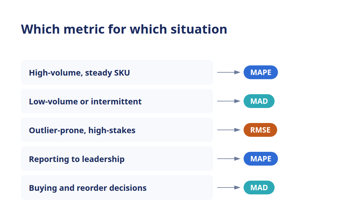
Notice MAPE shows up twice, and that's fair, its readability is a real strength, right up until sales get thin. On a slow mover, swap to MAD and you'll trust the number again. This is exactly the trade-off the MAPE deep-dive walks through, where WAPE (weighted absolute percentage error) shows up as the volume-weighted fix.
Where WAPE and bias fit alongside the three
Two more names belong in this conversation, and both cover gaps the core trio leaves open. WAPE is the patch for MAPE's low-volume problem, it weights the error by sales volume, so a giant percentage on a tiny SKU stops distorting your catalog-wide read. Think of it as MAPE that behaves.
Forecast bias is the one that's genuinely different in kind. MAPE, MAD, and RMSE all measure the *size* of your misses and throw away the sign. Bias keeps the sign, so it tells you whether you're consistently over-forecasting (quietly building overstock) or under-forecasting (recurring stockouts). A forecast can post a healthy MAPE and still lean hard one way. That's why bias earns a spot next to a magnitude metric, not instead of one.
Should you track more than one metric?
Yes, track at least one magnitude metric plus bias, because a single number always flatters or misleads. MAPE alone hides slow-mover damage. MAD alone hides which SKU is off. RMSE alone hides steady performance behind one bad week. And none of the three catches a forecast quietly leaning one way, cycle after cycle. Pairing them closes those blind spots.
You don't need a wall of numbers, though. Metric overload is its own trap, where planners collect so many readings that none of them drives a decision. The fix is a small, deliberate default.
A sensible default trio
For most eCommerce catalogs, three readings cover the ground without noise. Keep MAPE for the shareable percentage leadership expects. Keep MAD in units so the number translates into buys, and lean on it harder for your slow movers. Then run bias to catch the directional lean that magnitude metrics can't see. That combination tells you *how big* the miss is, *in what unit*, and *which way* it tilts.
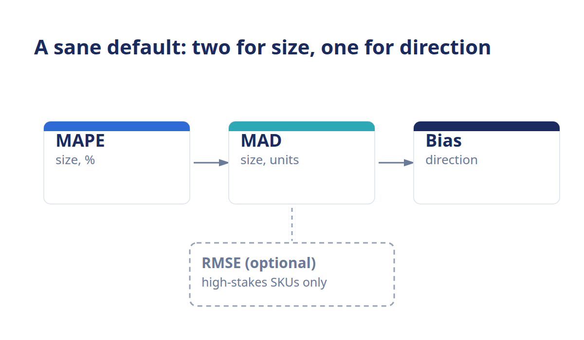
Layer RMSE on top only for the SKUs where one large miss would genuinely hurt, a hero product, a high-margin launch, anything where a single stockout blows the quarter. It's a spotlight, not a floodlight.
Avoiding metric overload
The point of a metric is to change a decision. If a number on your dashboard has never once altered what you bought, it's decoration, not measurement. Cut it. Every metric you keep should map to an action, a percentage you report, a MAD you buy against, a bias you correct. When you catch a lean, you fix the source, and the whole trio starts working together. You can't improve what you don't measure, but measuring what you'll never act on changes nothing.
This is where tracking more than one metric stops being a spreadsheet chore. AI-powered demand forecasting can score every SKU on multiple metrics at once and surface the ones drifting out of range, so you're reading exceptions instead of rebuilding reports. Conative's inventory planning platform tracks forecast accuracy across your catalog and flags where a forecast is slipping, and you can see how the scoring works on the forecast accuracy page. Less time assembling the dashboard, more time deciding what to buy. For the bigger picture on what these numbers mean together, the forecast accuracy overview ties the whole toolkit into one view.
Ready to stop grading your forecast by one number that flatters it? See a demo and watch Conative AI score accuracy across your catalog.
Frequently asked questions
What's the most common forecast accuracy metric?
MAPE is the most common forecast accuracy metric in eCommerce, mainly because it reports in a percentage that's easy to share and compare across products. It's a fair default for healthy, steady sellers. Just watch it on low-volume SKUs, where dividing by near-zero sales inflates the percentage and makes the number unreliable.
Can you use MAPE and RMSE together?
Yes, and pairing them is common. MAPE gives you a clean, shareable percentage for reporting and cross-SKU comparison, while RMSE flags the rare large miss that a percentage average can smooth over. Using both means you catch both steady drift and outlier weeks. Most planners add bias as a third read to cover direction.
Which metric is best for intermittent demand?
MAD is usually the safer read for intermittent or lumpy demand. Because it stays in units instead of percentages, it doesn't blow up when sales sit near zero the way MAPE does on slow movers. RMSE stays stable in units too, but one outlier can dominate it. Many planners lean on MAD for the long tail.
Is there one metric for the whole catalog?
No single metric fits an entire catalog well. High-volume staples, one-season items, and slow movers each behave differently, so a single yardstick flatters some SKUs and misleads on others. The better approach is to match the metric to the SKU profile, MAPE for steady sellers, MAD for the long tail, and pair it with bias.
Where does WAPE fit among these?
WAPE (weighted absolute percentage error) is the fix for MAPE's biggest weakness. It weights the percentage error by sales volume, so a huge percentage on a tiny SKU stops distorting your catalog-wide accuracy. Reach for WAPE when your MAPE is being dragged around by low-volume items. The MAPE deep-dive covers it in full.
Should bias be on the dashboard too?
Yes. MAPE, MAD, and RMSE all measure the size of your misses and discard the direction, so a forecast can look accurate and still lean one way every cycle. Bias keeps the sign and tells you whether you're building overstock or heading for stockouts. Pairing a magnitude metric with bias is the most common sensible default.