MAPE Scores: What Good Looks Like in Retail
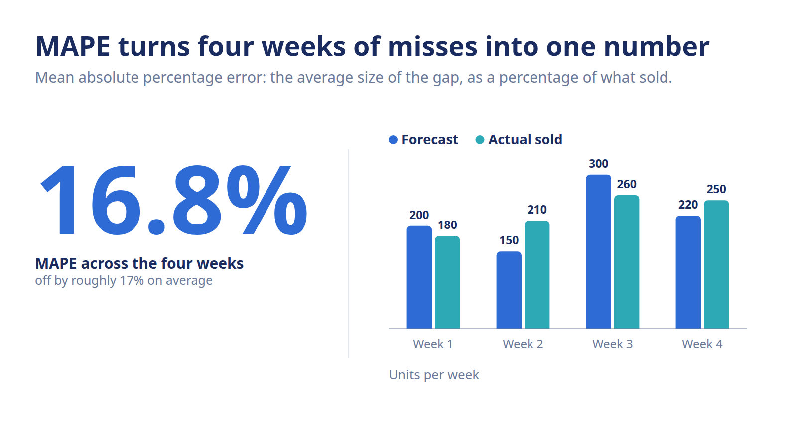
MAPE is your forecast's average percentage error. Learn the MAPE formula, a worked example, what a good MAPE score is by SKU type, and when WAPE beats it.
Leadership wants one number for forecast quality. Something clean they can drop in a deck and compare quarter over quarter. Nine times out of ten, MAPE is the number they mean. It's a single percentage, it's easy to explain, and it travels well between teams. But that same simplicity hides a trap: MAPE quietly lies on your slow movers, and if you don't know where it breaks, you'll grade your forecast on the wrong curve.
MAPE (Mean Absolute Percentage Error) is the average of the absolute percentage gaps between forecast and actual sales across several periods. A 20% MAPE means your forecast was off by about 20% on average. It's easy to share and compare, but it distorts badly when sales sit near zero, which is where WAPE becomes the better read.
What is MAPE and how do you calculate it?
MAPE, short for Mean Absolute Percentage Error, is the average of the absolute percentage errors between your forecast and actual sales across several periods. For each period you find how far off you were as a percentage of what actually sold, drop the sign, and average those percentages. The result is one number: on average, how wrong the forecast was.
MAPE sits one level up from raw forecast error, the raw gap between what you predicted and what sold. MAPE takes those gaps, turns each into a percentage, and rolls them into a single average. That's what makes it shareable: it strips out the units, so a 15% MAPE on socks and a 15% MAPE on jackets mean the same thing at a glance.
The MAPE formula, in plain English
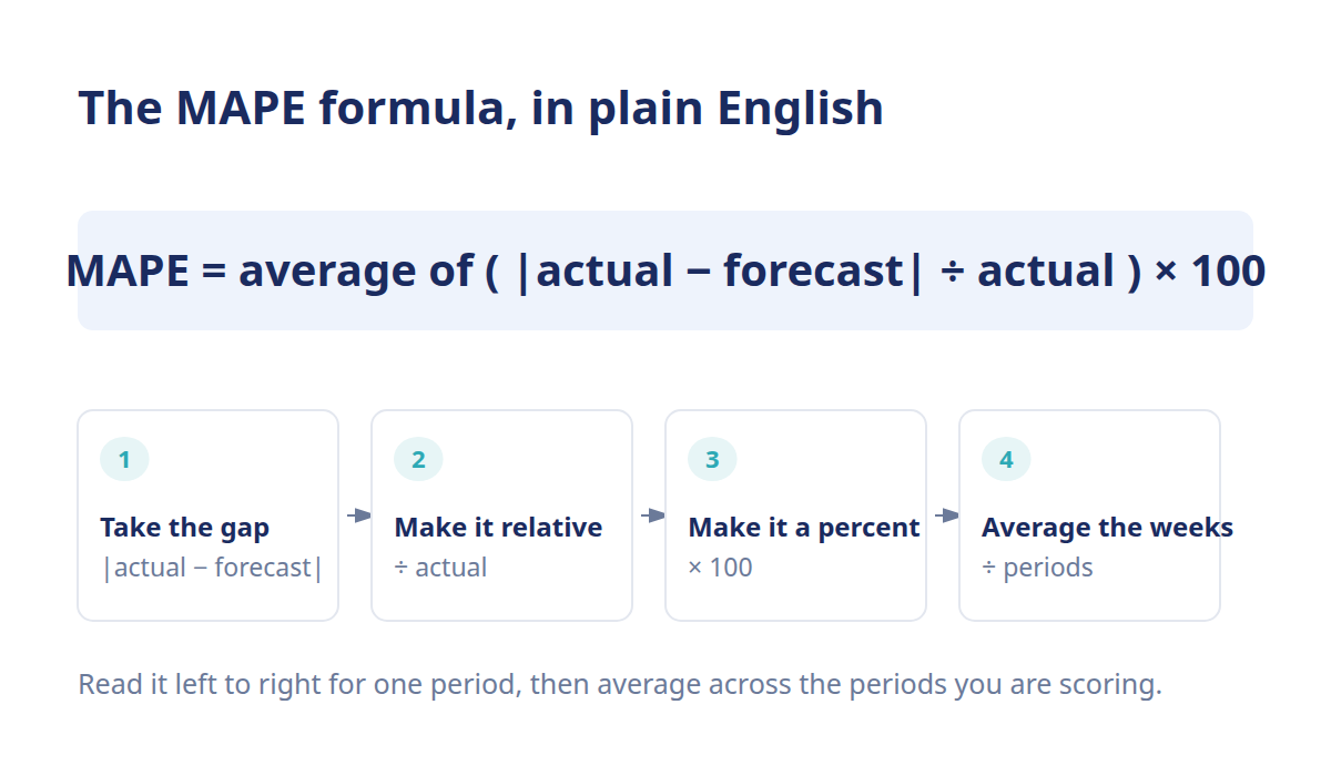
Here's the whole thing, no Greek required:
MAPE = average of ( |actual − forecast| ÷ actual ) × 100
Read it left to right for one period:
- Take the gap. Subtract your forecast from actual sales, ignore whether it's positive or negative. That's the absolute error.
- Make it relative. Divide that gap by the actual sales for the period. A 20-unit miss means more on a 40-unit week than on a 400-unit week.
- Turn it into a percentage. Multiply by 100.
- Average across periods. Add up the percentage errors and divide by how many periods you measured.
The absolute part matters. MAPE doesn't care which direction you missed, over or under, it all counts as error. That's a feature when you want a clean magnitude, and a blind spot when direction is the thing that's hurting you. For the directional read, you want forecast bias, which keeps the sign.
A worked MAPE example
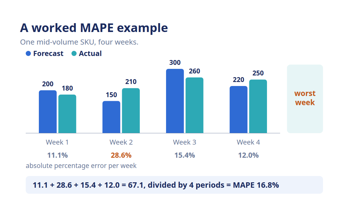
Say you're checking a mid-volume SKU over four weeks. Here's the forecast against what actually sold, with the math laid out:
- 1: forecast: 200; actual: 180; absolute error: 20; absolute % error: 11.1%
- 2: forecast: 150; actual: 210; absolute error: 60; absolute % error: 28.6%
- 3: forecast: 300; actual: 260; absolute error: 40; absolute % error: 15.4%
- 4: forecast: 220; actual: 250; absolute error: 30; absolute % error: 12.0%
Add the four percentage errors: 11.1 + 28.6 + 15.4 + 12.0 = 67.1. Divide by four periods and you get a MAPE of about 16.8%. Plain English: over the month, this forecast was off by roughly 17% on average.
Notice week 2 does most of the damage. One bad week where you under-forecast by 60 units on a 210-unit base drags the whole average up. That's worth remembering, MAPE is an average, so a single ugly period can make an otherwise solid forecast look shaky. And a run of small misses can hide inside a healthy-looking number.
What's a good MAPE score for retail?
There's no universal MAPE target. A good MAPE depends on the SKU's demand pattern, its volume, and how far ahead you're forecasting. As a rough frame, steady best-sellers often land in the 10-30% range, while new and seasonal items run higher because their demand is genuinely harder to predict.
Anyone who quotes you a single "good" number without asking what you sell is guessing.
A MAPE benchmark by SKU type
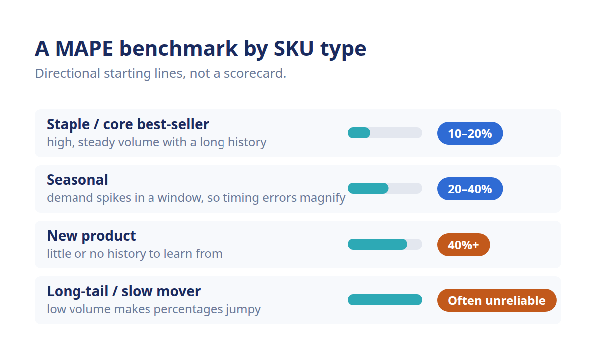
Different products live at different accuracy floors. Grading a new launch against a year-round staple is grading on the wrong curve. Here's a directional guide, treat it as a starting line, not a scorecard:
- Staple / core best-seller: typical mape range: 10-20%; why: High, steady volume with a long sales history to learn from.
- Seasonal: typical mape range: 20-40%; why: Demand spikes around a window, so timing errors magnify quickly.
- New product: typical mape range: 40%+; why: Little or no history, you're forecasting closer to an educated estimate.
- Long-tail / slow mover: typical mape range: Often unreliable; why: Low volume makes the percentage swing wildly (more on that below).
These ranges are directional, not promises, your real floors depend on your category, your data quality, and your forecast horizon. A brand selling basics will beat these numbers; a fast-fashion label chasing trends won't, and that's normal.
Judge MAPE against your own trend, not a fixed line
The number that actually matters isn't whether you hit 18% or 24%. It's whether your MAPE is trending down on the SKUs that drive your revenue. A planner who shaves five points off the top 20% of products by sales beats one chasing a perfect score across the long tail every time.
So track MAPE over time, by SKU tier, and ask the useful question: is this getting better on the stuff that pays the bills? For how MAPE fits alongside the other accuracy metrics and where each one earns its place, the forecast accuracy metrics comparison lays them side by side. And for the wider view of what accuracy is and how to measure it end to end, start with the forecast accuracy overview.
Why does MAPE break at low volume, and what's the fix?
MAPE breaks at low volume because the formula divides by actual sales. When actual sales sit near zero, that division blows the percentage up to numbers that don't mean anything useful. A forecast that's technically close in units can post a MAPE in the hundreds of percent, which makes MAPE the wrong metric for intermittent and slow-moving SKUs.
The near-zero-denominator weakness
Picture a slow mover where you forecast 5 units for the week and 1 actually sold. In units, you missed by 4, not a disaster on a trickle-selling item. But run it through MAPE: |5 − 1| ÷ 1 = 400%. One quiet week just posted a 400% error.
Now imagine a week where zero units sold. You can't divide by zero at all, so the period either breaks the calculation or gets quietly dropped, which skews the average either way. This is why MAPE punishes intermittent demand unfairly. It's not that the forecast is terrible; it's that the metric wasn't built for near-zero denominators. On your long tail, MAPE cries wolf.
WAPE fixes the low-volume distortion
The fix is WAPE, Weighted Absolute Percentage Error. Instead of averaging each period's percentage error, WAPE sums all your absolute errors and divides by the sum of all actual sales. One division, done at the total level, so no single low-volume period can hijack the result.
Run the four-week table from earlier through it: total absolute error is 150 units, total actual sales is 900, so WAPE = 150 ÷ 900 = 16.7%. Nearly identical to MAPE here, because the volumes are steady. The gap opens up on lumpy demand, where WAPE stays sane and MAPE spirals. Use MAPE when volume is steady and you want a per-period read; reach for WAPE when your catalog has slow movers or intermittent sellers dragging the average around.
This is also where the tooling matters. Grading MAPE by hand across a few hero SKUs is fine; doing it across a few thousand, every week, by SKU tier, is where spreadsheets fall apart. AI-powered demand forecasting scores accuracy per SKU and flags where the forecast is drifting. That means less time rebuilding a tracking sheet and more time acting on the misses that cost real money. You can see how the scoring works in Conative's forecast accuracy capability.
Frequently asked questions
Is a lower MAPE always better?
Lower is usually better, but not blindly. A very low MAPE on a slow mover can be meaningless because the percentage swings wildly at low volume. And MAPE ignores direction, so a low score can still hide a forecast that consistently leans high or low. Read it alongside bias and against the SKUs that actually drive revenue.
What's the difference between MAPE and WAPE?
MAPE averages each period's percentage error, giving every period equal weight regardless of volume. WAPE sums all absolute errors and divides by total actual sales, so high-volume periods carry more weight. WAPE stays stable when sales sit near zero, which is exactly where MAPE distorts. Use WAPE for catalogs with slow or intermittent movers.
Why is MAPE bad for new products?
New products have little or no sales history and often low early volume. MAPE divides by actual sales, so those low-volume weeks inflate the percentage error dramatically, even when your unit miss is small. A new SKU can post a MAPE well above 40% and still be a reasonable forecast. Judge new launches by units or WAPE instead.
Can MAPE be over 100%?
Yes. Because MAPE divides the error by actual sales, any period where the forecast exceeds actual by more than the actual itself pushes past 100%. This happens constantly on low-volume SKUs, where a small unit miss becomes a huge percentage. A MAPE over 100% usually signals a volume problem with the metric, not necessarily a broken forecast.
Is MAPE the same as forecast accuracy percentage?
Not exactly, though they're related. People often quote accuracy as 100% minus MAPE, so a 20% MAPE implies roughly 80% accuracy. It's a handy shorthand, but it isn't a strict rule, since MAPE can exceed 100% and drive that math negative. Treat accuracy percentage as a rough translation of MAPE, not an identical measure.
What MAPE do AI forecasting models target?
There's no fixed target, since the achievable MAPE depends on the product's demand pattern and volume. AI-powered models generally aim to beat the baseline MAPE of manual or rule-based methods on the same SKUs by weighing more signals than historical sales alone. So judge a model against the method it replaced on your own SKUs, not against a number from someone else's catalog.